Office Outlet
Sometimes it's just not meant to be...
Despite everyone loving the work we did to help the evolution of the Office Outlet brand, the stars didn’t quite align for it to become reality. It's still a really useful example of our approach so we thought it was worth adding to our blog.
EVALUATION
Our rationale was that the name Office Outlet implied end of line, seconds or imperfect goods. In addition, the overall appearance of the brand, and its warehouse approach, just prompts a price-based discussion from the start, not a sustainable strategy in our view.
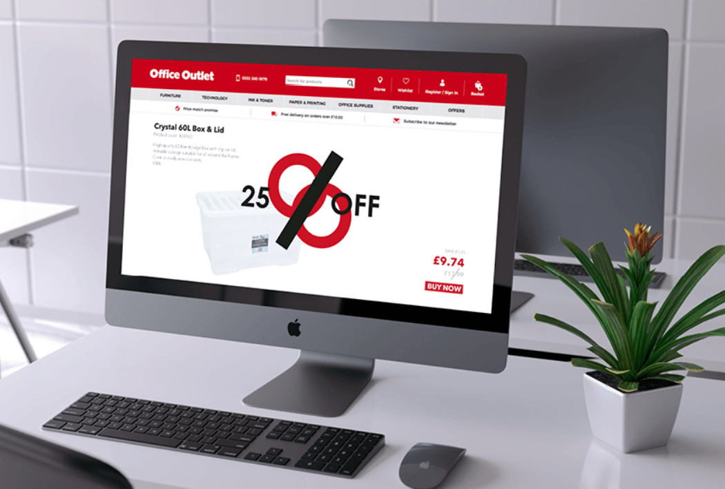
The client was already onboard with this thinking and had suggested refining the name to OO, to create a more graphic expression of the brand. We really liked this and wanted to bring it to life, making it mean something useful to the clientele, both personal and business.
DIFFERENTIATION
Using Archetypes in Branding, we pinpointed NETWORKER as a key character trait. With this in mind, the OO brand could be positioned as a vital component in making connections between people, products and business services.
EXPRESSION
We applied this thinking to three elements;
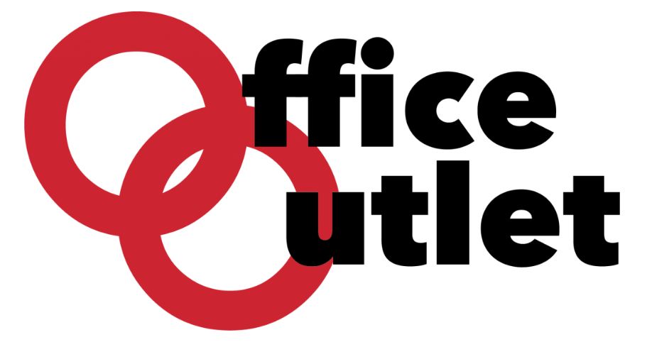
1. A revised OO logo featuring interlocking Os to reinforce the idea of making connections.
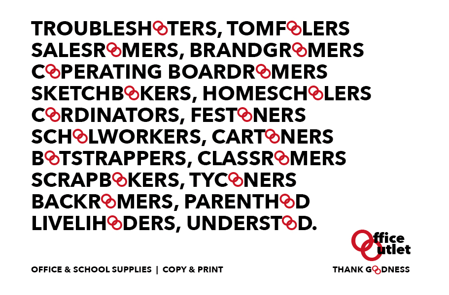
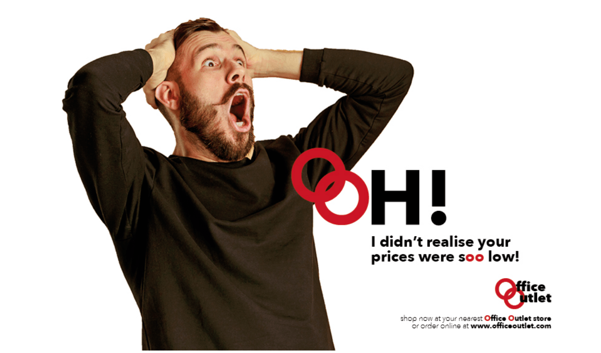
2. Communication using words containing double Os.
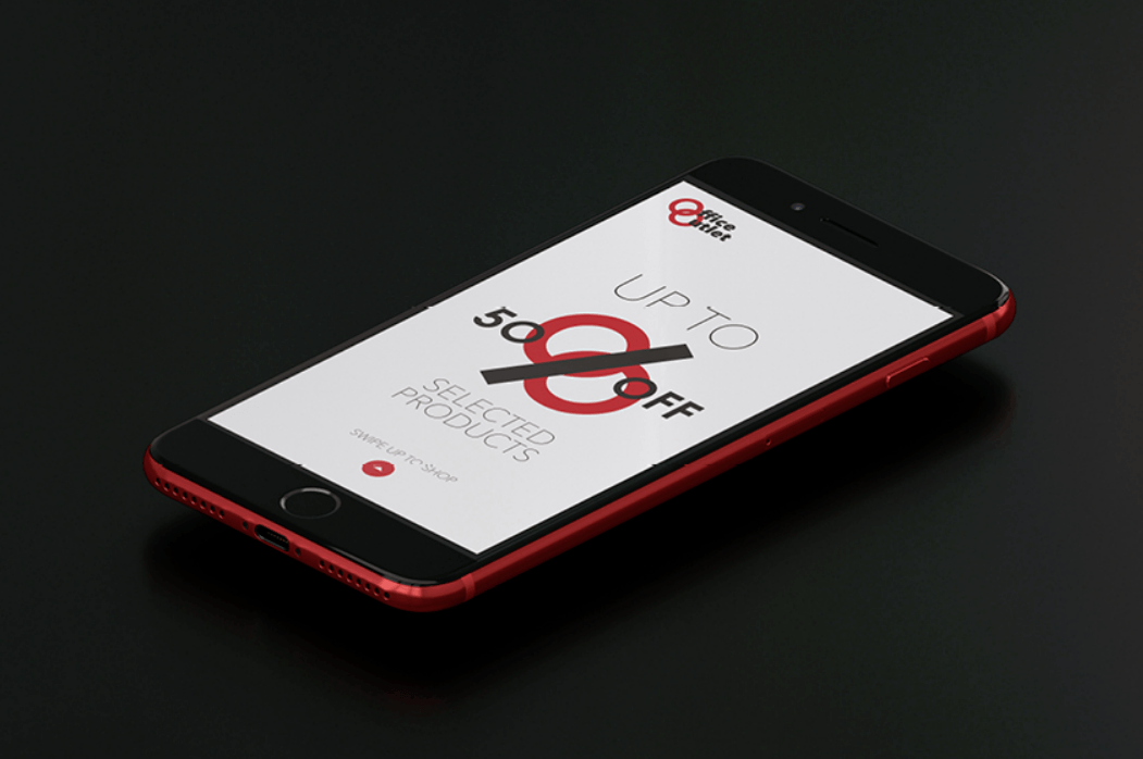
3. Using the double O’s to own the idea of % discounts.
All of these were designed to place the brand at the heart of the message, and link it more closely with OO’s customers.
We were very pleased with the results but do let us know what you think?


© 2022 Air Creative Marketing. All Rights Reserved.


