
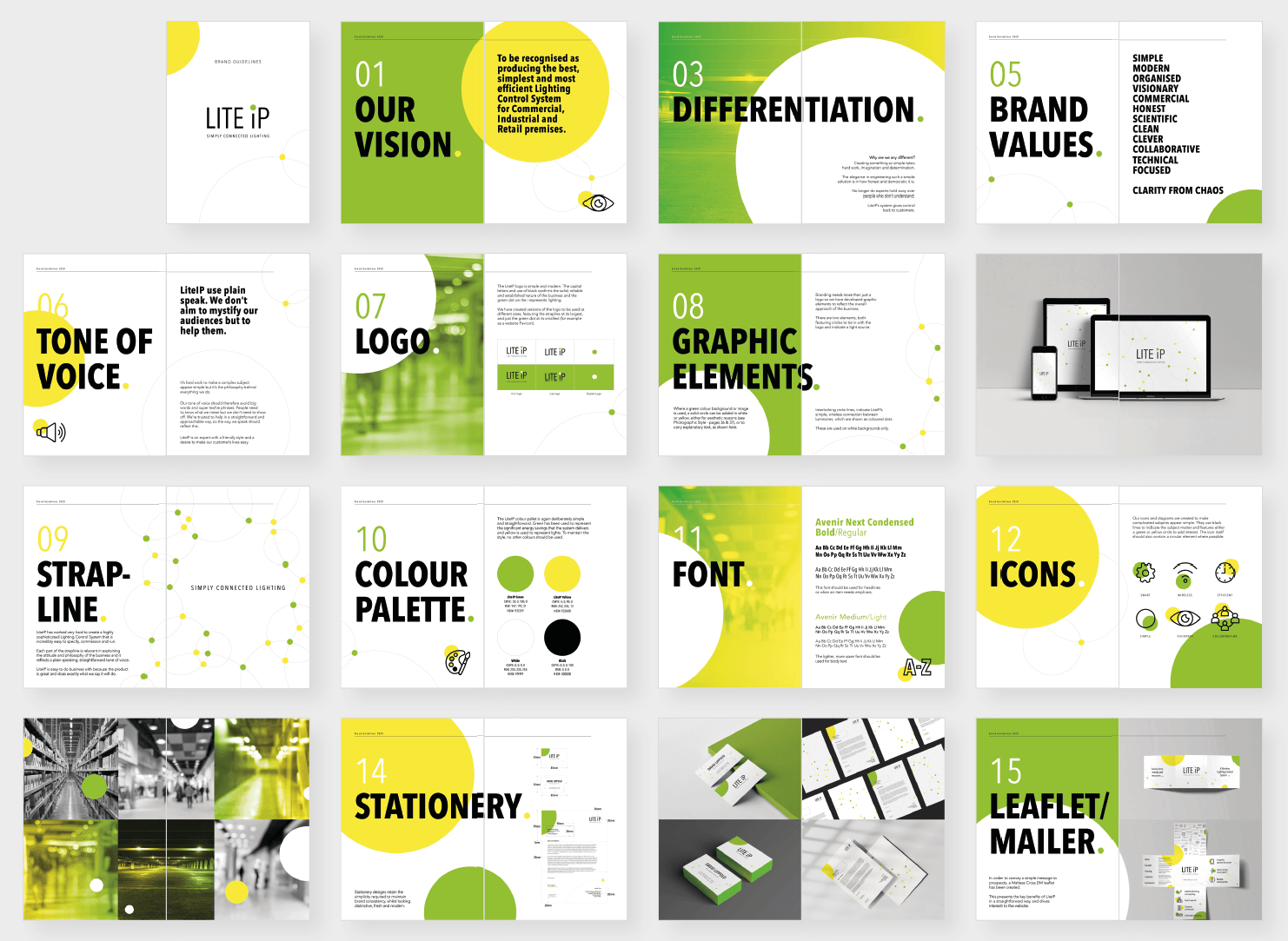
Our Lite IP rebrand is a simple story Over the years, the LiteIP brand had stayed much the same, largely as they have been working hard developing their system, and building a reputation, very much behind the scenes. Eventually LiteIP realised that, given the calibre of companies using their automated lighting control system, that they had been a bit shy about their credentials, experience and approach. So Kernel Mustard set out to rebrand the business to reflect the system as it is today, and the way the company now operates. Hiding in plain sight As is often the case, we discovered what the company and its clients knew all along. It turns out they are, and always have always been, pretty obsessed with creating simplicity. That might sound a bit strange but it's this simplicity that trade customers and end-users really like about LiteIP's wireless lighting control system. Branding with conviction We were keen to identify why David and his team started the business in the first place, and articulate what they really believe in. It boiled down to them wanting an elegant and straightforward solution to a problem that has been around for years. Commercial lighting control systems save companies money on their electricity bills. But many systems are so complex that they need expensive, professional installation and setup. LiteIP believes that such systems really don’t have to be complicated and should also pay for themselves. That's exactly why they created a wireless commercial lighting control system that is simple to specify, simple to install and simple to run. It doesn’t need complex wiring or a degree in computer science to install and operate. It’s run using a simple app and uses less energy to save clients' money. Creating something so simple has taken hard work, imagination and determination. The LiteIP solution means that experts no longer hold sway over people who don’t understand. LiteIP’s system gives control back to customers. SIMPLY CONNECTED LIGHTING Developing a new brand is as much about us explaining what it does as it is about logos, colours and fonts. So we've also crafted a strapline which we think sums us up well. SIMPLY CONNECTED LIGHTING. No fuss. No nonsense. It's simple. It's connected. The Visionary Engineer An important part of the rebrand process is to consider a personality for the brand: if LiteIP was a person, what human traits would he or she portray? Using personality archetypes, based on the work of Jung and Freud, together we decided LiteIP's should be that of a Visionary Engineer. We think it's a great mixture of creativity and practicality and a great direction setter for the company culture. Here are some characteristics of these two archetypes;

Tim Harford is the maker of one of the best blogs I've heard in recent years; Cautionary Tales. In it he tells stories of human error, of tragic catastrophes and hilarious fiascos. Oil tankers crash in broad daylight, vital military ideas are carelessly given away to the Nazis, and a shouty man in a uniform pulls off an audacious heist. Alongside the drama, each story has a moral that emerges from psychology, economics, even design. And in each of these he draws remarkable conclusions and lessons for everyday life in the 21st Century. Check it out here; http://timharford.com/etc/more-or-less/ He also has a brilliant Ted talk to take a look at; https://www.ted.com/talks/tim_harford_trial_error_and_the_god_complex#t-822959 His Ted talk really got me to thinking; how does the desire to create brands that demonstrate certainty work in an economy like ours; one that actually evolves by trial and error? We know that people respond to certainty - it's how many of our more dubious politicians got themselves elected. So brands that have certainty, about their philosophy, about their products, and about their beliefs, are attractive to consumers. But we also know that individuals with certainty, or 'the God complex' as Tim calls it, have caused many of the most terrible moments in the history of mankind. Mainly because they obstinately refused to change direction. So, for a brand, having a clear direction should be tempered with a willingness to respond to events. "Knowing what we know today means we are heading this way, but that will change if we learn something new." Massive brands like Nokia didn't quite manage this. Nor did Kodak or Blockbuster Video. Had these huge companies had a different approach, could they have retained the flexible mindset needed to evolve? If they had articulated a broader conviction, from top to bottom, would it have helped? Imagine Blockbuster Video having a conviction along the lines of; 'we believe in the power of cinema to change the world' . And what if they had created Netflix's current strapline 'see what's next ' ? Clearly both of these are very broad outlooks and completely agnostic to the retail model that obsessed them to the point of destruction. We'll never know for sure, but check out a view of Blockbuster's demise from the CMO at the time; https://www.marketingweek.com/blockbusters-cmo-failure/ Having a conviction gives brands something to constantly chase after, something to innovate in the name of, something to find new ways of delivering. So might it be the way to offer certainty without succumbing to the God complex? By truly embracing the power of trial and error.

Most of us are familiar with the phrase Challenger brand; the confident new kids on the block, the ones with belief coming out of their ears and a desire to change the world. They are rewriting the rules, moving the goalposts, redefining or creating sectors with bravado and a different way of operating. Adam Morgan, an expert on the topic and author of the seminal ‘Eating The Big Fish’, puts it well: “A challenger brand is defined, primarily, by a mindset – it has business ambitions bigger than its conventional resources, and is prepared to do something bold, usually against the existing conventions or codes of the category, to break through.” And consumers are buying into challenger brands, left, right and centre. They seem more willing to trust these new brands than ever before. And that is driven by an evolution in the way the Challenger expresses themselves, to create authentic emotional connections. Whilst many long established businesses look on in envy, maybe a dose of challenger brand thinking is just what they really need to reinvigorate themselves. Here are a few ways that any brand can behave like a challenger brand. QUESTION EVERYTHING Just because you've always done things a certain way, doesn't mean you should continue with the same approach. The Challenger questions every aspect of the market, and finds a new way of operating or presenting their products or services. So why can't you? Nothing is stopping you except the will and desire to make change happen. BE AMBITIOUS Challenger brands are often fuelled by fear of failure. They need to act fast and succeed quickly for investors to stay on board. And this dynamic makes them very ambitious. But when did ambition become exclusive to start-ups? Set yourself big targets and see your swagger return. SPEED IT UP Bigger businesses sometimes have structures that make it hard for them to be truly responsive. So change things. Even giants like Apple have small working groups who can respond to changes in the market very quickly. HAVE CONVICTION Believe in something. Challenger brands generally have real conviction about an important issue. More than that, they demonstrate just what they are doing about those convictions. Find the belief at the heart of your business and reorganise yourself around it. STAND OUT The thing that the Challenger does so well is stand out. And it's because they generally have a laser focus on one specific subject and stick to it with tenacity. This is a great lesson for all businesses. Your brand needs to focus on one idea that customers can understand and buy into. CONNECT WITH CUSTOMERS Nobody wants to be friends with someone who constantly repeats 'be my friend' over and over. But they do want to be friends with someone who has similar thoughts, beliefs and ideas. Communicate your brand view of the world with sincerity and passion and people will be attracted to you. EVOLVE OR DIE The biggest lesson that the Challenger can teach us is that things change. Stand still and your brand will be overtaken by the new ways, probably before you have chance to react. Keep moving forwards. Keep evaluating. Keep developing new initiatives. Even at the risk of cannibalising existing revenue streams. Challenger brands do all of these as a natural effect of the situation they find themselves in. Even a small dent in an existing market can mean the difference between success and failure. But established brands run the risk of becoming yesterday's news if they don't learn the lessons that the Challenger can teach. Buy 'Eating the Big Fish ' on Amazon.

Vegan, raw chocolate? Oh here we go. Cardboard taste and oh so serious attitude. Or so we very wrongly thought... A lovely group of people with an excellent product, combined with advice from a former marketing director of Thornton's, all added up to a very professional project with interesting results. EVALUATION The product is based on just three raw ingredients so hopes weren't very high when we tasted the product. But we were in for a surprise. Enjoy Raw Chocolate is absolutely delicious! After we regained our senses we considered the implications. Consumers were clearly not only those who have allergies or choose a vegan diet, but everyone who loves chocolate. We also thought that the element of surprise would be interesting to focus on. Showing the revelation could become a key ingredient of making the product appeal to people via digital marketing; after all it's quite difficult to taste it through a browser. Together with the client, we identified potential consumers, more by their attitude that their demographics; - People who appreciate quality chocolate. - People who are mindful about what they put into their body. - People who like to treat themselves and others. - People who recognise that sometimes the only answer is chocolate. DIFFERENTIATION In reviewing the market, we noticed a common theme across many chocolate brands; high design values on their packaging, and a serious tone on their credentials (ingredients, sustainability). They all look great, but not too many stand out against the opposition, something even more important to a relatively small business looking to make an impact. We concluded that there was room for a brand with fun at its heart. The resulting positioning statement - 'serious chocolate for fun-loving people' - offered a clear brief for designers to use when designing packaging and additional collateral. EXPRESSION As you can see from the image shown, the client has clearly run with this, updating the brand for the 21st Century. We're impressed by how balanced this now looks with equal emphasis on quality and fun. Enjoy! Check out their new website by clicking here .
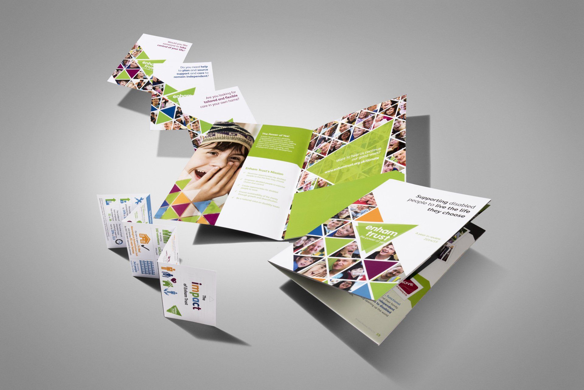
Enham Trust is a disability charity that works with over 8,500 individuals each year, helping them have increased independence and choice in the cornerstone areas of their lives. EVALUATION Have spent almost 18 months rebranding, the charity had a shiny new identity and the strapline, The Power of Yes. But something wasn't quite right. The use of black and white images seemed very sombre and didn't really convey the positivity suggested by the strapline. DIFFERENTIATION Having spent some time at Enham, it was obvious that the real difference in this amazing charity was the people. All of the disabled people that Enham Trust help have the most amazing spirit and positive outlook on life. Our visit there was genuinely moving. So it seemed obvious to bring this to the fore. EXPRESSION To reflect the upbeat nature of the entire organisation, images were changed to colour and clients were shown facing the camera and looking happy and positive about their world. ACTIVATION The style has been applied across a whole range of materials both online and off including the Annual Review, fundraising direct mail, regular newsletters, advertising and literature. Here are just a few examples of the work we have produced. We’re very proud of our association with Enham Trust and the fantastic work that they do every day.
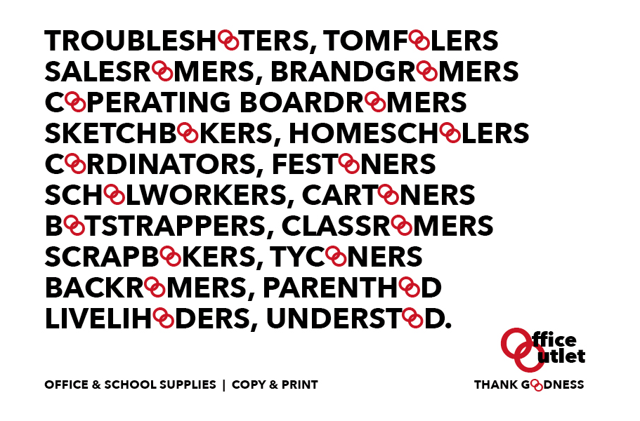
Despite everyone loving the work we did to help the evolution of the Office Outlet brand, the stars didn’t quite align for it to become reality. It's still a really useful example of our approach so we thought it was worth adding to our blog. EVALUATION Our rationale was that the name Office Outlet implied end of line, seconds or imperfect goods. In addition, the overall appearance of the brand, and its warehouse approach, just prompts a price-based discussion from the start, not a sustainable strategy in our view. The client was already onboard with this thinking and had suggested refining the name to OO, to create a more graphic expression of the brand. We really liked this and wanted to bring it to life, making it mean something useful to the clientele, both personal and business. DIFFERENTIATION Using Archetypes in Branding, we pinpointed NETWORKER as a key character trait. With this in mind, the OO brand could be positioned as a vital component in making connections between people, products and business services. EXPRESSION We applied this thinking to three elements; 1. A revised OO logo featuring interlocking Os to reinforce the idea of making connections. 2. Communication using words containing double Os. 3. Using the double O’s to own the idea of % discounts. All of these were designed to place the brand at the heart of the message, and link it more closely with OO’s customers. We were very pleased with the results but do let us know what you think?